Resource Centers
Using Variable Control Charts
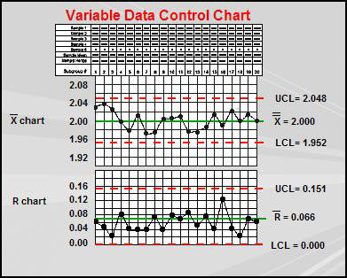
Two types of charts are used to track variable data; one for averages and one for ranges. These charts are commonly used together and are known as an X-bar & R Chart.
- Raw data are not plotted on X-bar & R charts. Instead, samples of data are collected in subgroups of 2 to 5 data points and the mean and the range of those samples are plotted on the charts.
The Chart monitors the process center, or location.
- The subgroup mean (all of the points in the subgroup added up and divided by the number of points in the subgroup) is plotted on the X-bar Chart.
The R Chart monitors the process variation, or dispersion.
- The subgroup range (highest point minus the lowest point in the subgroup) is plotted on the R Chart.
As the data points for each subgroup are plotted, the points are connected to the previous point and the charts are interpreted to determine if one of the out-of-control patterns has occurred.
- Typically, only one of the charts will go out-of-control at any one time.
- Remember to add a comment on a chart to indicate the action taken to correct an out-of-control situation.


