Resource Centers
Visually Measuring Variation
Histogram
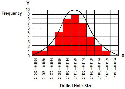
A histogram is a special type of graph that allows you to “see” the variation in your process. It is sometimes called a frequency distribution.
- Each cell in a histogram is a chute that you are going to drop your data points into. As points fall into the appropriate chutes, they build on top of one another and a pattern begins to emerge.
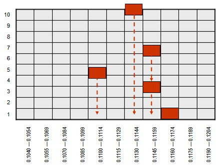
- To set up a histogram, subtract the lowest data point from the highest data point and divide that number by 10 to determine the cell width. Be sure to round the calculated number so that the cell widths are easy to use.
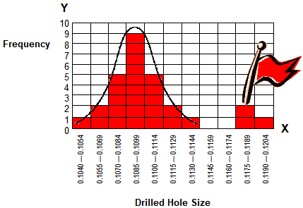
A distribution that forms a bell-shaped curve is called a normal distribution.
- The closer the data points fall to the center, the less variation there is in the process. The further away the data points fall from the center, the more variation there is in the process.
Points that fall outside of the normal distribution are called outliers and indicate something different than normal has happened in the process. Outliers are important because they send up an immediate red flag that something unusual happened in our process. Whenever we get one of these strange situations, we must immediately find out what caused it and eliminate the cause.